HEMA stands for Hollandse Eenheidsprijzen Maatschappij Amsterdam (Dutch Unit Price Company Amsterdam), and has been synonymous with reliability, optimism and being quintessentially Dutch since 1926. HEMA believes in affordable design that is accessible to everyone – a principle they like to share with customers in their likeable and fresh approach. Because at HEMA, everything is still truly HEMA.
including Eindhoven and Leiden, Mall of the Netherlands
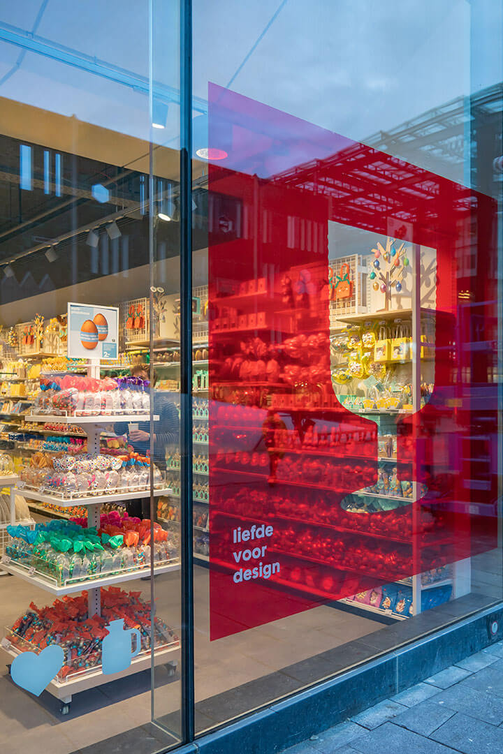
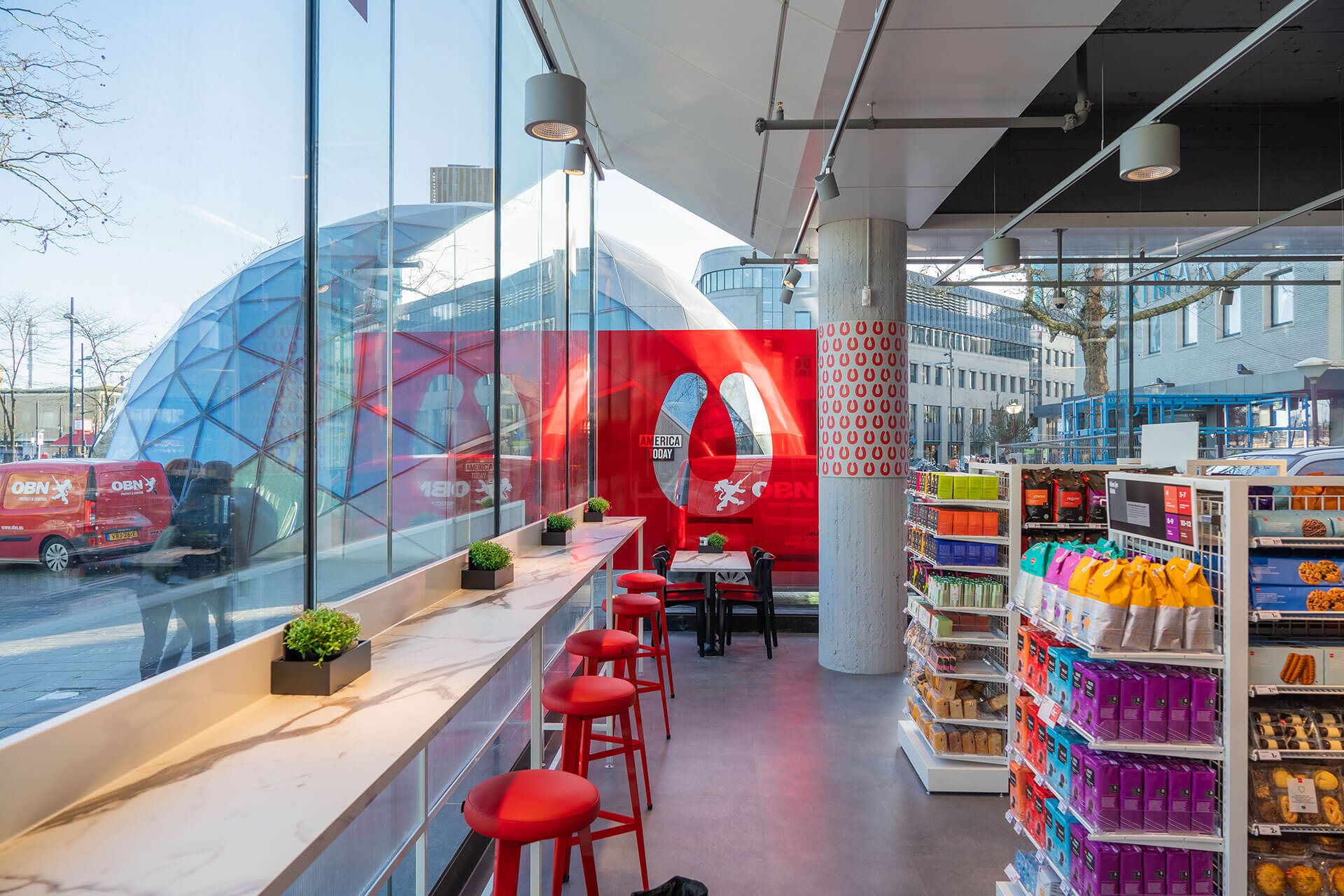
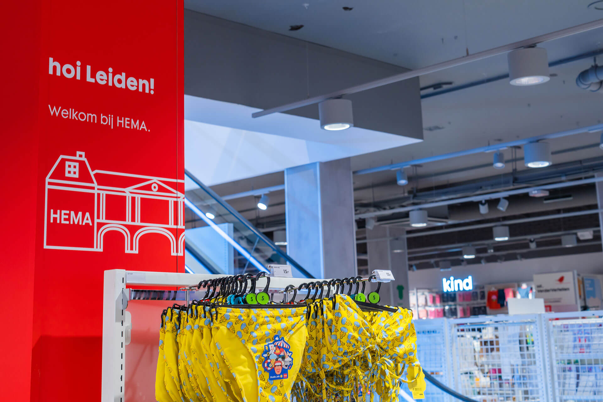
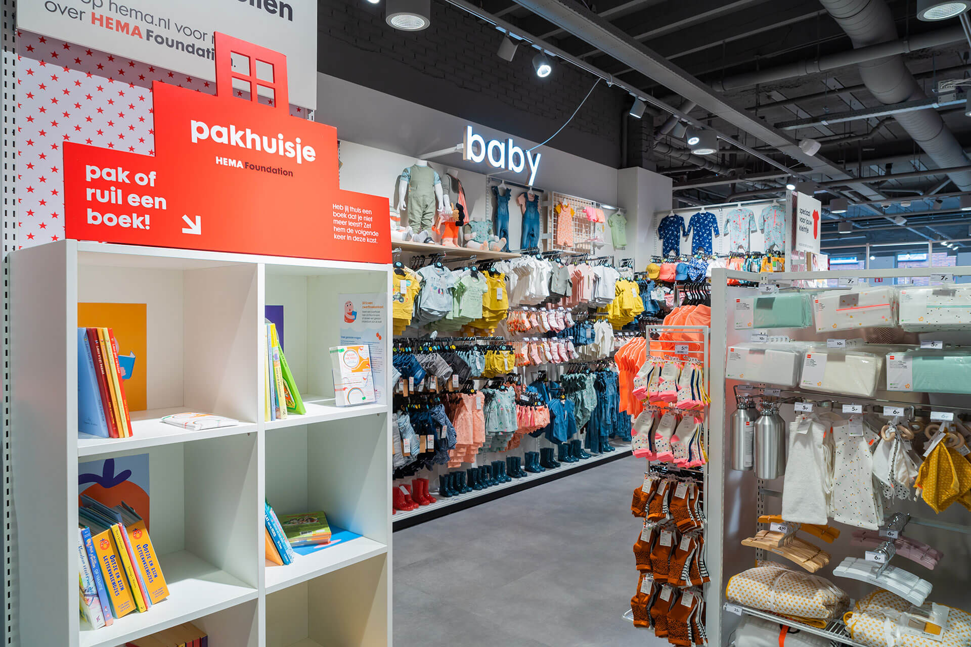
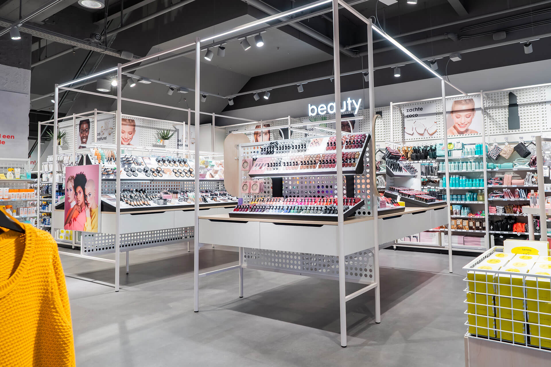
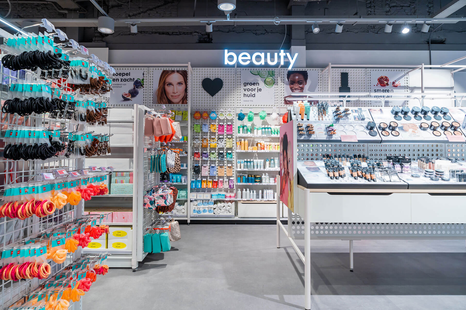
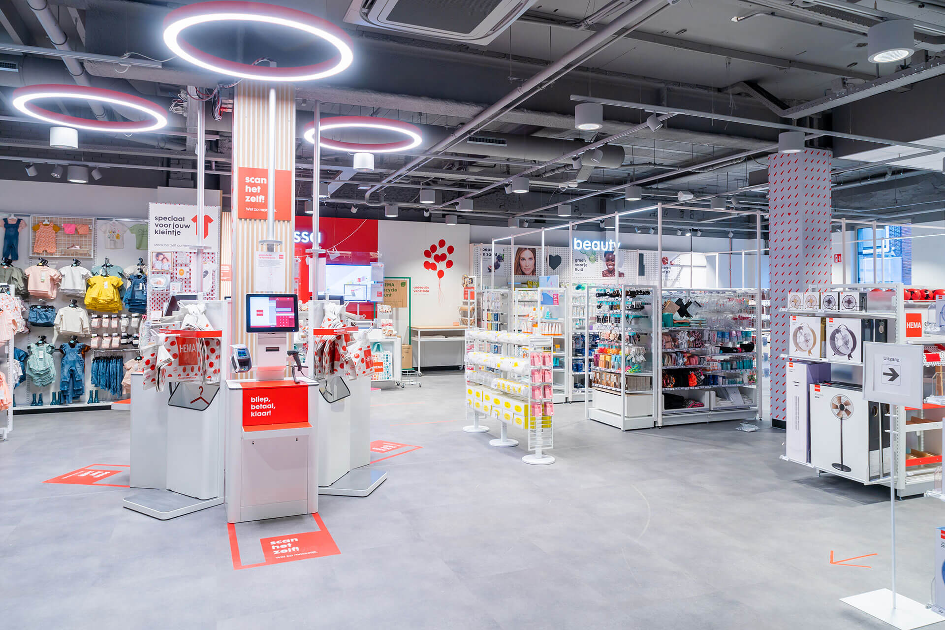
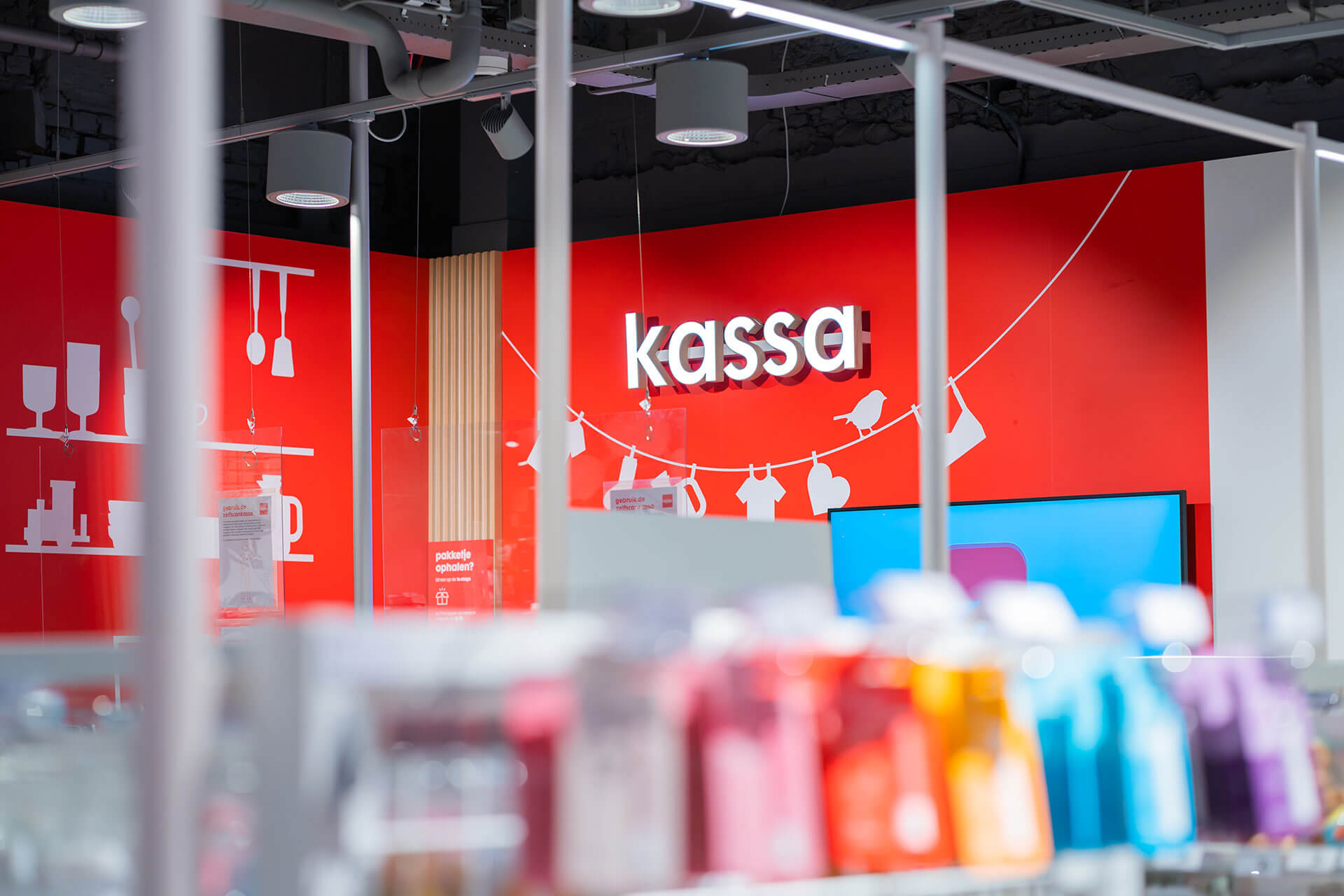
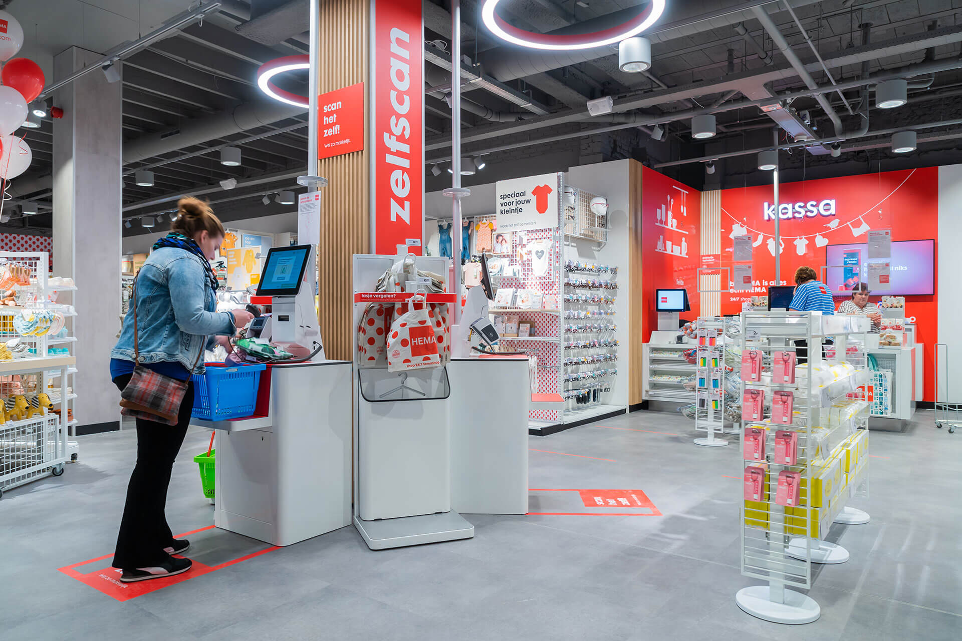
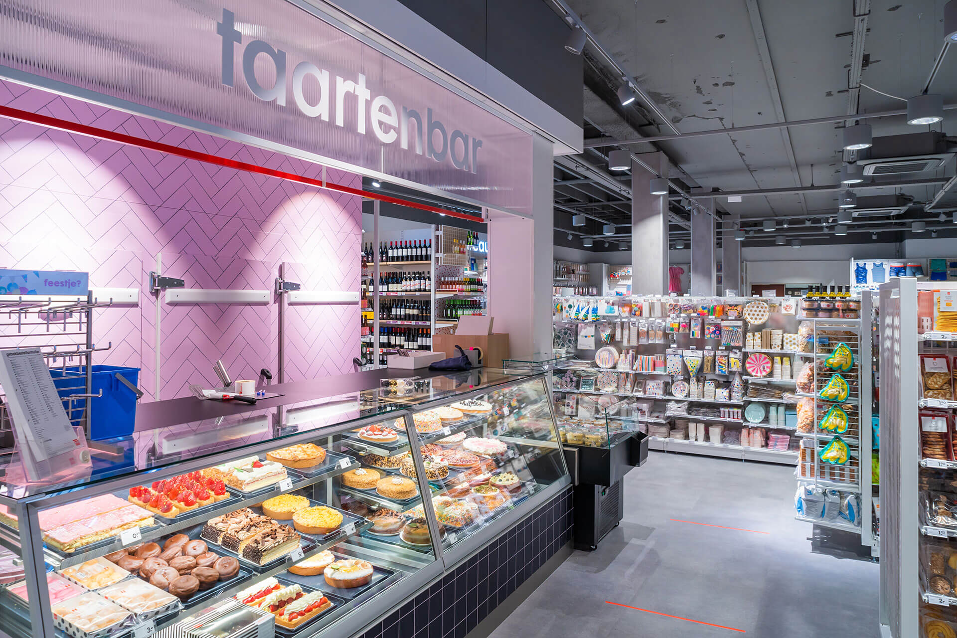
Branding, customer journey, navigation, façade
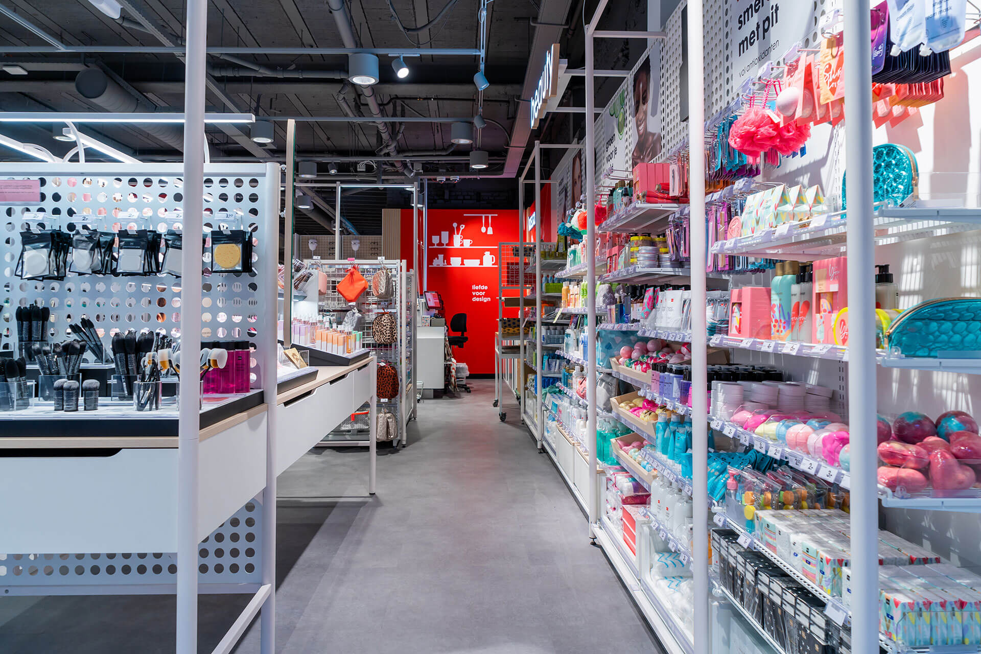
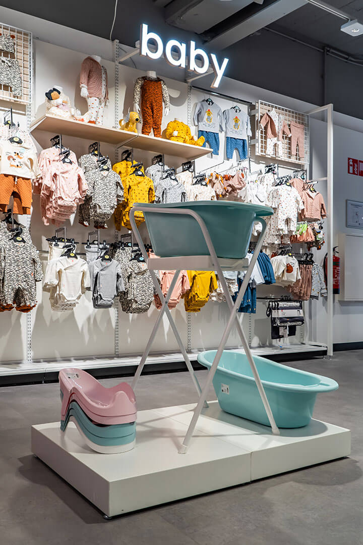
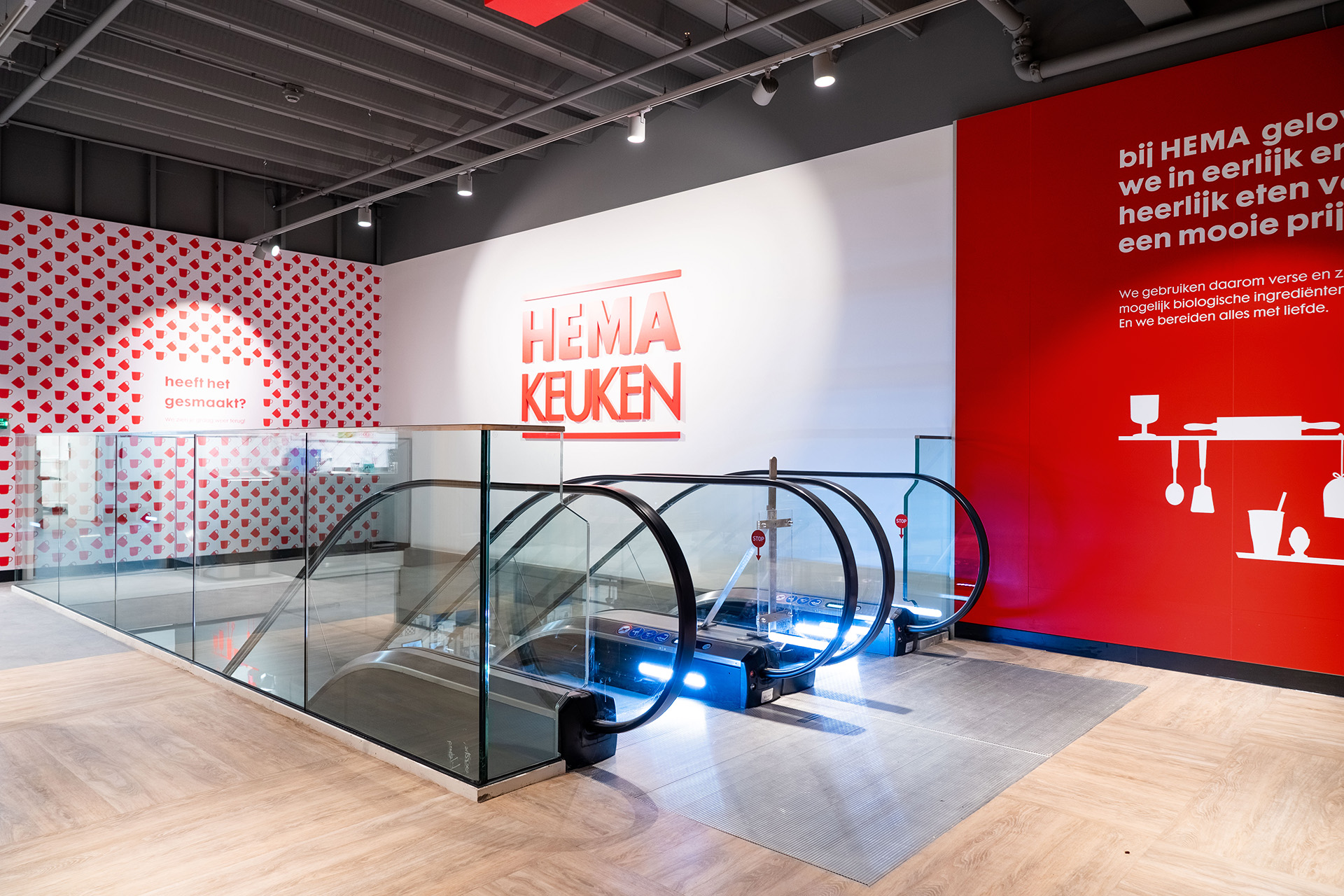
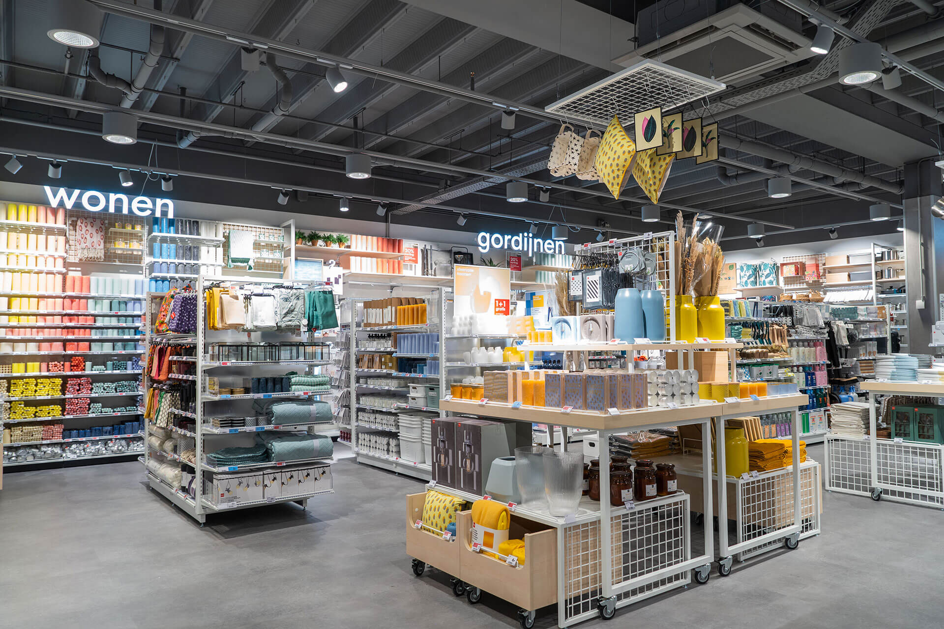
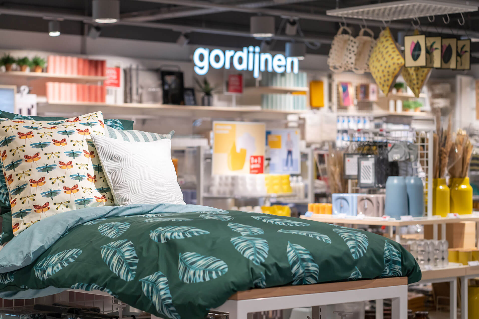
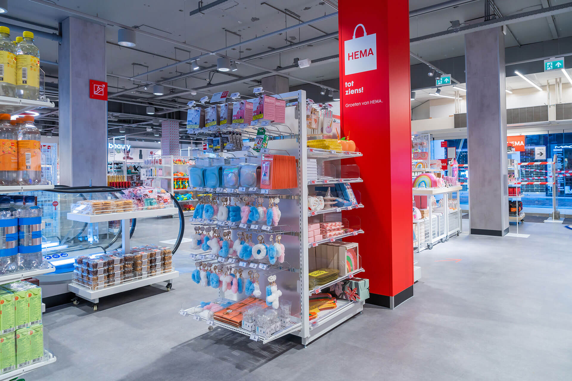
At HEMA, you’ll find fabulous products at great prices. Customers know exactly what they’re going to get – great everyday items in the shop’s signature colours and design. HEMA has you covered for sausages, cups of coffee and even offers an enjoyable photo service. The brand also designs and manufactures their range with care and consideration for people and the environment. This is an area HEMA wants to continue developing, to delight customers without losing its sense of self.
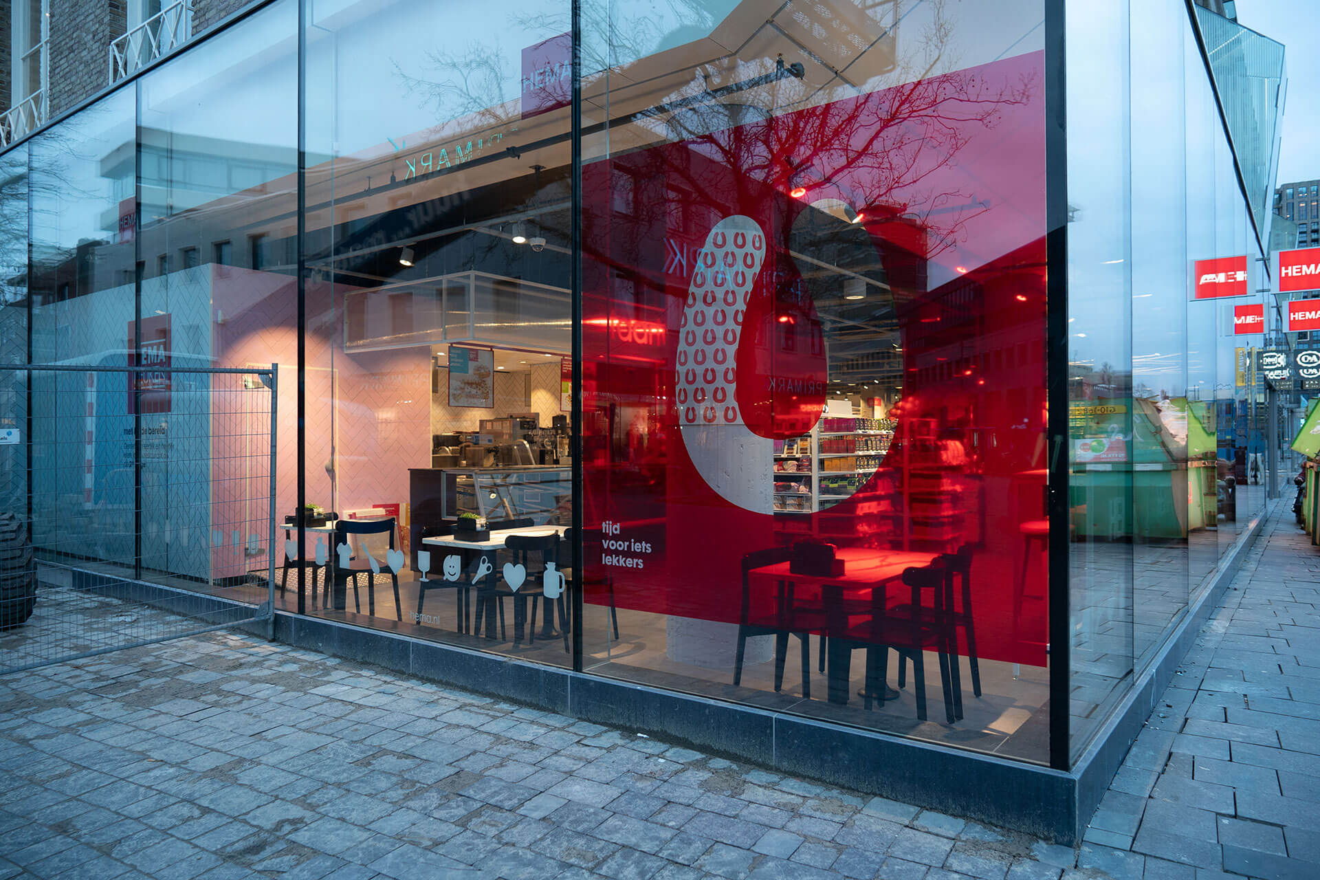
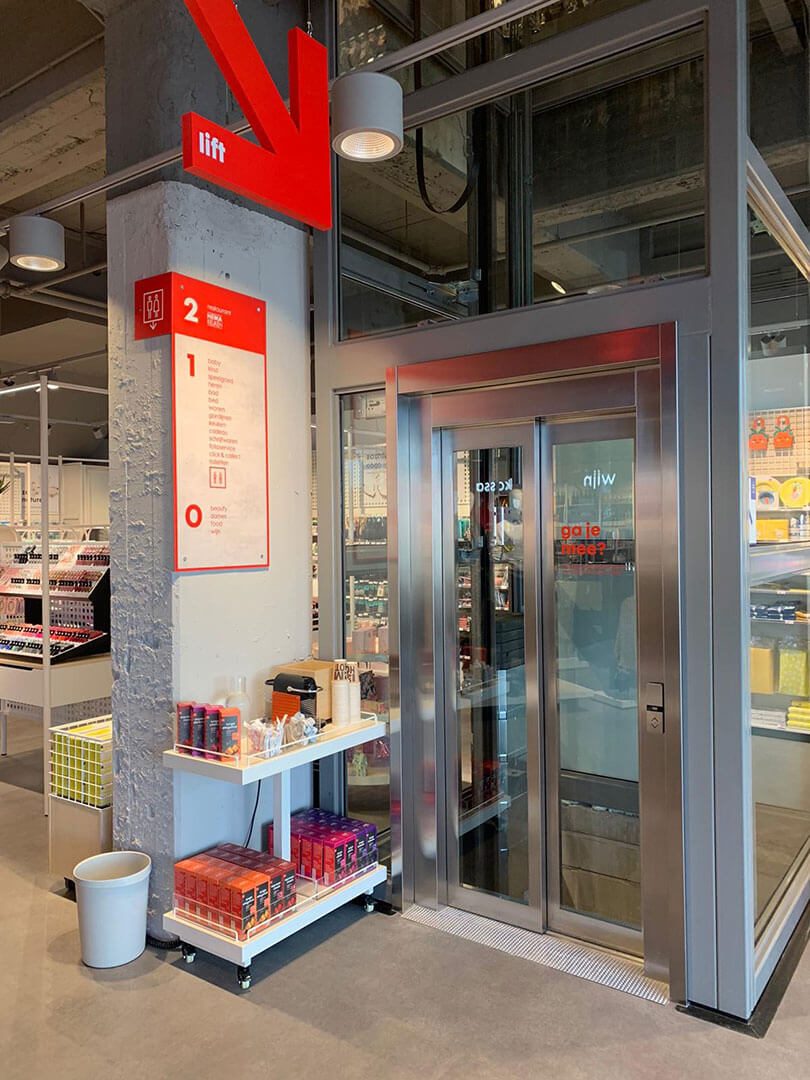
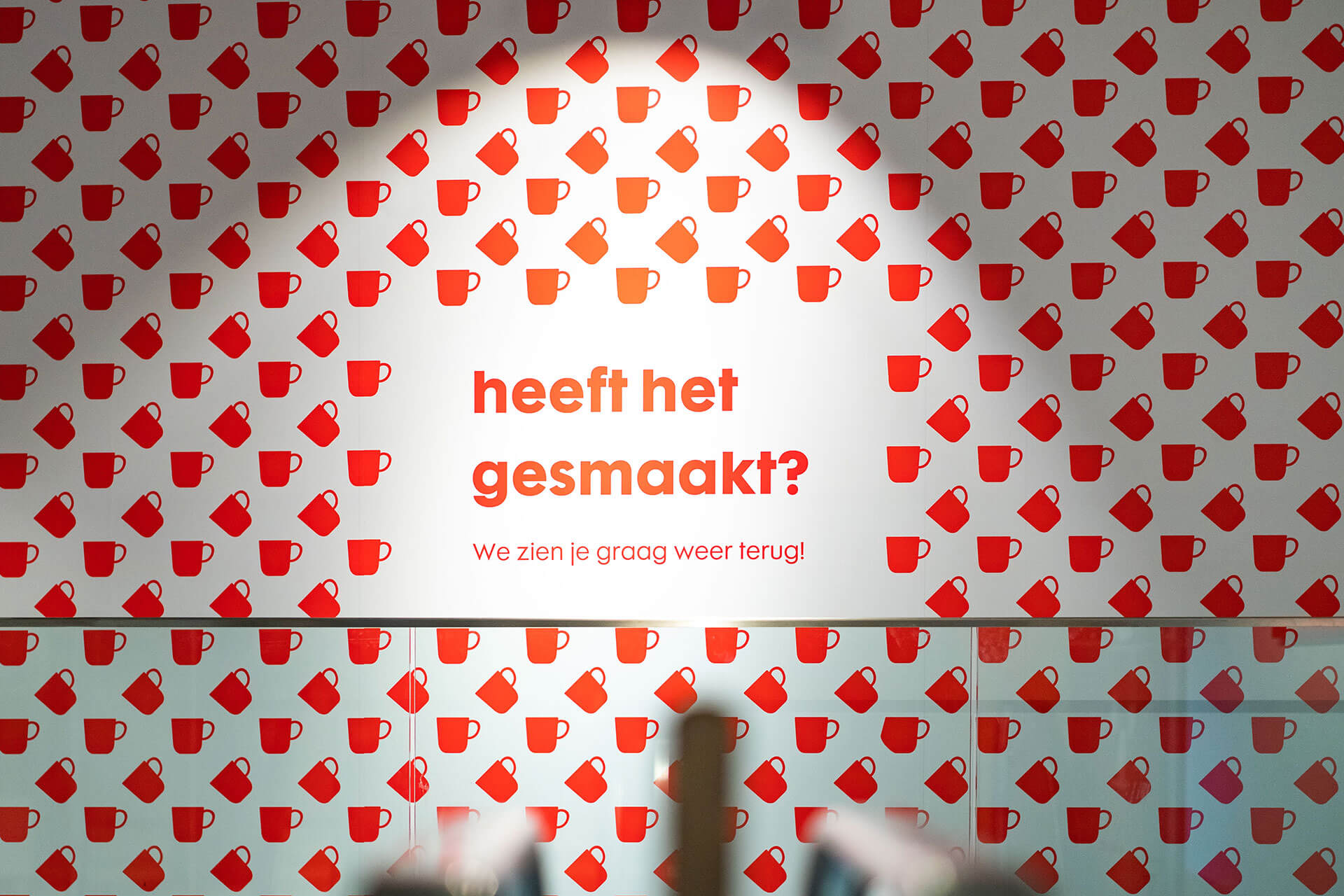
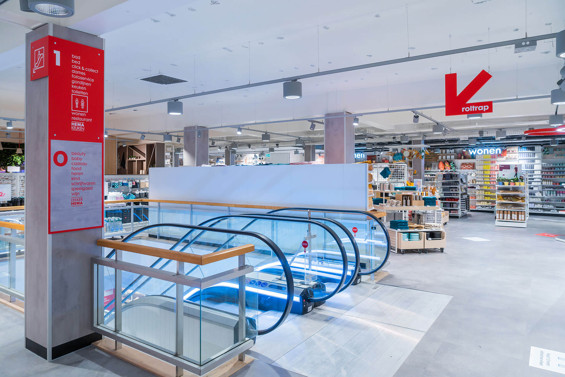
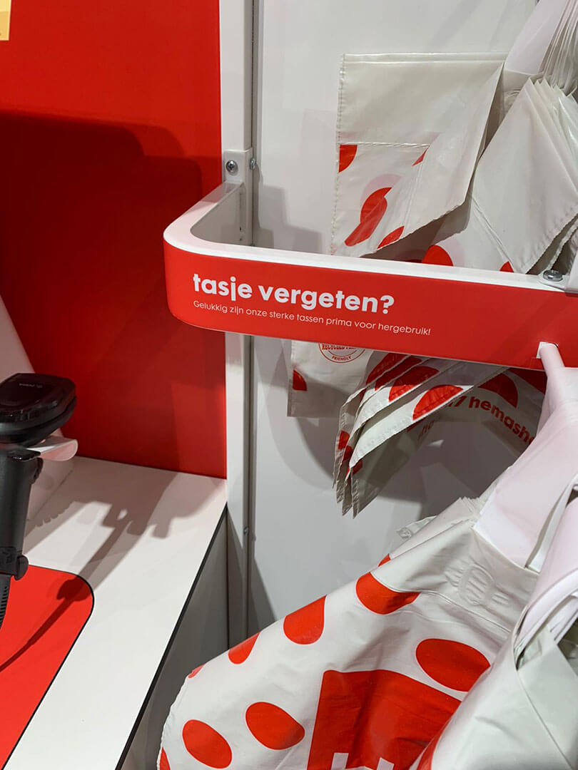
HEMA’s philosophy is one to be proud of. As such, we developed a language that allows the brand to get its message across loud and clear, but also nice and simply and above all, recognisably. At various touch points throughout the shop, a likeable brand statement explains what the brand stands for. HEMA services are more visible, lifts and toilets are easier to find and clear signing guides you perfectly through the shop. An iconic language for an iconic brand, that’s now even more visible on the high street.
“A distinct tone-of-voice to represent brand values.” Wondering which language best suits your brand?”
Get in touch